Survival curve plots are an essential output of survival analysis. The main Python survival analysis packages show only how to work with Matplotlib and hide plot details inside convenience functions. This article shows how to draw survival curves with two other Python plot libraries, Altair and Plotly.
Python
survival analysis
Author
Brian Kent
Published
June 29, 2021
All three of the major Python survival analysis packages—convoys, lifelines, and scikit-survival—show how to plot survival curves with Matplotlib. In some cases, they bake Matplotlib-based plots directly into trained survival model objects, to enable convenient one-liner plot functions.
The downside of this convenience is that the code is hidden, so it’s harder to customize or use a different library. In this article, I’ll show how to plot survival curves from scratch with both Altair and Plotly.
Survival curves describe the probability that a subject of study will “survive” past a given duration of time. This article assumes you’re familiar with the concept; if this is the first you’ve heard of it, lifelines and scikit-survival both have excellent explanations.
Lifelines introduces survival curve estimation with an example about the tenure of political leaders, using a duration table dataset that’s included in the package. Each row represents a head of state; the columns of interest are duration, which is the length of each leader’s tenure, and observed, which indicates whether the end of each leader’s time in office was observed (it would not be observed if that leader died in office or was still in power when the dataset was collected).
Code
from lifelines.datasets import load_dddata = load_dd()data[['ctryname', 'ehead', 'duration', 'observed']].sample(5, random_state=19)
ctryname
ehead
duration
observed
1022
Mauritania
Mustapha Ould Salek
1
1
1565
Switzerland
Ruth Dreifuss
1
1
763
Ireland
Eamon de Valera
2
1
1722
United States of America
Bill Clinton
8
1
1416
Somalia
Abdirizak Hussain
3
1
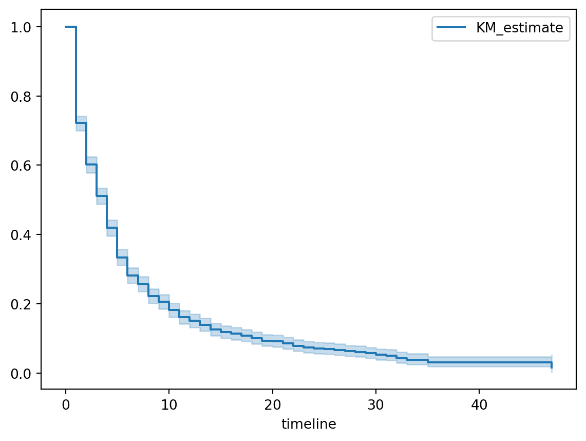
A fitted lifelines Kaplan-Meier model has a method plot_survival_function that uses Matplotlib. It’s certainly convenient but by hiding all the logic, it’s harder to see how to customize the plot or implement it in a different library.
Code
from lifelines import KaplanMeierFitterkmf = KaplanMeierFitter()kmf.fit(durations=data['duration'], event_observed=data['observed'])kmf.plot_survival_function() # this is the function we're unpacking
<AxesSubplot: xlabel='timeline'>
How to plot a survival curve with Altair
Here’s how to generate the same plot from scratch with Altair. There are three things we need to do:
Process the lifelines model output.
Plot the survival curve, as a step function.
Plot the 95% confidence band, as the area between the lower and upper bound step functions.
The fitted lifelines Kaplan-Meier model has two Pandas DataFrames: survival_function_ and confidence_interval_. We need to combine these into a single DataFrame to make the Altair plot. We also need to convert the index into a column so we can reference it as the X-axis.
Now we can construct Altair plot objects: first the survival curve as a line mark, then the confidence band as an area mark on top of the line. The only trick is that we use interpolate='step-after' in both the line and area marks to create the correct step function.
It’s slightly trickier to draw the same plot with Plotly because Plotly’s confidence band solution is a bit funky. First, we set up the figure and add the survival curve as a line plot. We specify shape='hv' in the line parameters to get the correct step function.
Note that we don’t need to create a plot DataFrame here because we’re going to draw each Series as a standalone Plotly trace.
Next, we add traces for the upper and lower bounds of the confidence band, separately and in that order. The lower bound fills up to the next trace, which seems to be the previous trace defined in the code.
---title: "How to plot survival curves with Plotly and Altair"author: "Brian Kent"date: "2021-06-29"image: plotly_survival.pngcategories: [Python, survival analysis]description: | Survival curve plots are an essential output of survival analysis. The main Python survival analysis packages show only how to work with Matplotlib and hide plot details inside convenience functions. This article shows how to draw survival curves with two other Python plot libraries, Altair and Plotly.format: html: include-in-header: text: <link rel="canonical" href="https://www.crosstab.io/articles/survival-plots/">---All three of the major Python survival analysis packages---[convoys][convoys],[lifelines][lifelines], and [scikit-survival][scikit-survival]---show how to plotsurvival curves with [Matplotlib][matplotlib]. In some cases, they bake Matplotlib-basedplots directly into trained survival model objects, to enable convenient one-liner plotfunctions.The downside of this convenience is that the code is hidden, so it's harder to customizeor use a different library. **In this article, I'll show how to plot survival curvesfrom scratch with both [Altair][altair] and [Plotly][plotly].**Survival curves describe the probability that a subject of study will“survive” past a given duration of time. This article assumes you'refamiliar with the concept; if this is the first you've heard of it,[lifelines][lifelines-intro] and [scikit-survival][sksurv-intro] both have excellentexplanations.Lifelines [introduces survival curve estimation][lifelines-km] with an example about thetenure of political leaders, using a [duration table][duration-article] dataset that'sincluded in the package. Each row represents a head of state; the columns of interestare `duration`, which is the length of each leader's tenure,and `observed`, which indicates whether the end of eachleader's time in office was observed (it would not be observed if that leader died inoffice or was still in power when the dataset was collected).```{python}from lifelines.datasets import load_dddata = load_dd()data[['ctryname', 'ehead', 'duration', 'observed']].sample(5, random_state=19)```A fitted lifelines [Kaplan-Meier][lifelines-km] model has a method `plot_survival_function` that uses Matplotlib. It's certainly convenient but by hiding all the logic, it's harder to see how to customize the plot or implement it in a different library.```{python}from lifelines import KaplanMeierFitterkmf = KaplanMeierFitter()kmf.fit(durations=data['duration'], event_observed=data['observed'])kmf.plot_survival_function() # this is the function we're unpacking```## How to plot a survival curve with AltairHere's how to generate the same plot from scratch with Altair. There are three things weneed to do:1. Process the lifelines model output.2. Plot the survival curve, as a step function.3. Plot the 95% confidence band, as the area between the lower and upper bound step functions.The fitted lifelines Kaplan-Meier model has two Pandas DataFrames: `survival_function_` and `confidence_interval_`. We need to combine these into a singleDataFrame to make the Altair plot. We also need to convert the index into a column so wecan reference it as the X-axis.```{python}df_plot = kmf.survival_function_.copy(deep=True)df_plot['lower_bound'] = kmf.confidence_interval_['KM_estimate_lower_0.95']df_plot['upper_bound'] = kmf.confidence_interval_['KM_estimate_upper_0.95']df_plot.reset_index(inplace=True)df_plot.head()```Now we can construct Altair plot objects: first the survival curve as a line mark, thenthe confidence band as an area mark on top of the line. The only trick is that we use`interpolate='step-after'` in both the line and area marks tocreate the correct step function.```{python}#| warning: falseimport altair as altline = ( alt.Chart(df_plot) .mark_line(interpolate='step-after') .encode( x=alt.X("timeline", axis=alt.Axis(title="Duration")), y=alt.Y("KM_estimate", axis=alt.Axis(title="Survival probability")) ))band = line.mark_area(opacity=0.4, interpolate='step-after').encode( x='timeline', y='lower_bound', y2='upper_bound')fig = line + bandfig.properties(width='container')fig```## How to plot a survival curve with PlotlyIt's slightly trickier to draw the same plot with Plotly because Plotly's confidenceband solution is a bit funky. First, we set up the figure and add the survival curve asa line plot. We specify `shape='hv'` in the `line` parameters to get the correct step function.Note that we don't need to create a plot DataFrame here because we're going to draw eachSeries as a standalone Plotly trace.```{python}#| output: falseimport plotly.graph_objs as gofig = go.Figure()fig.add_trace(go.Scatter( x=kmf.survival_function_.index, y=kmf.survival_function_['KM_estimate'], line=dict(shape='hv', width=3, color='rgb(31, 119, 180)'), showlegend=False))```Next, we add traces for the upper and lower bounds of the confidence band, separatelyand in that order. The lower bound fills up to the next trace, which seems to be the*previous* trace defined in the code.```{python}#| output: falsefig.add_trace(go.Scatter( x=kmf.confidence_interval_.index, y=kmf.confidence_interval_['KM_estimate_upper_0.95'], line=dict(shape='hv', width=0), showlegend=False,))fig.add_trace(go.Scatter( x=kmf.confidence_interval_.index, y=kmf.confidence_interval_['KM_estimate_lower_0.95'], line=dict(shape='hv', width=0), fill='tonexty', fillcolor='rgba(31, 119, 180, 0.4)', showlegend=False))```Finally, we add axis titles and styling, then show the plot.```{python}fig.update_layout( xaxis_title="Duration", yaxis_title="Survival probability", margin=dict(r=0, t=10, l=0), font_size=14, xaxis_title_font_size=18, yaxis_title_font_size=18)fig.show()```[convoys]: https://better.engineering/convoys/[scikit-survival]: https://scikit-survival.readthedocs.io/en/stable/[lifelines]: https://lifelines.readthedocs.io/en/stable/[matplotlib]: https://matplotlib.org/[altair]: https://altair-viz.github.io/[plotly]: https://plotly.com/python/[lifelines-intro]: https://lifelines.readthedocs.io/en/stable/Survival%20Analysis%20intro.html[sksurv-intro]: https://scikit-survival.readthedocs.io/en/latest/user_guide/understanding_predictions.html[lifelines-km]: https://lifelines.readthedocs.io/en/stable/Survival%20analysis%20with%20lifelines.html[binder-nb]: https://mybinder.org/v2/gh/CrosstabKite/gists/f6638e4b6546631763b23d92296ccb196200ddfa?filepath=survival_plots.ipynb[repo]: https://github.com/CrosstabKite/gists/blob/main/survival_plots.ipynb[duration-article]: events-to-durations