Recently we argued that confidence intervals are a poor choice for analyzing staged rollout experiments. In this article, we show a better way: a Bayesian approach that gives decision-makers the answers they really need. Check out our interactive Streamlit app first, then the article for the details.
experimentation
Python
data apps
Author
Brian Kent
Published
May 7, 2021
Tip
This article is the second part of a two-part series. The first part—why confidence intervals are a bad idea for worst-case analysis—is here. The Streamlit app that accompanies this article is also explained in the post Streamlit review and demo: best of the Python data app tools.
We recently argued that confidence intervals are a bad way to analyze staged rollout experiments. In this article, we describe a better way. Better yet, we’ve built a live, interactive Streamlit app to show the better way. Check it out, then follow along as we talk through the methodology, the app, and the decision-making process.
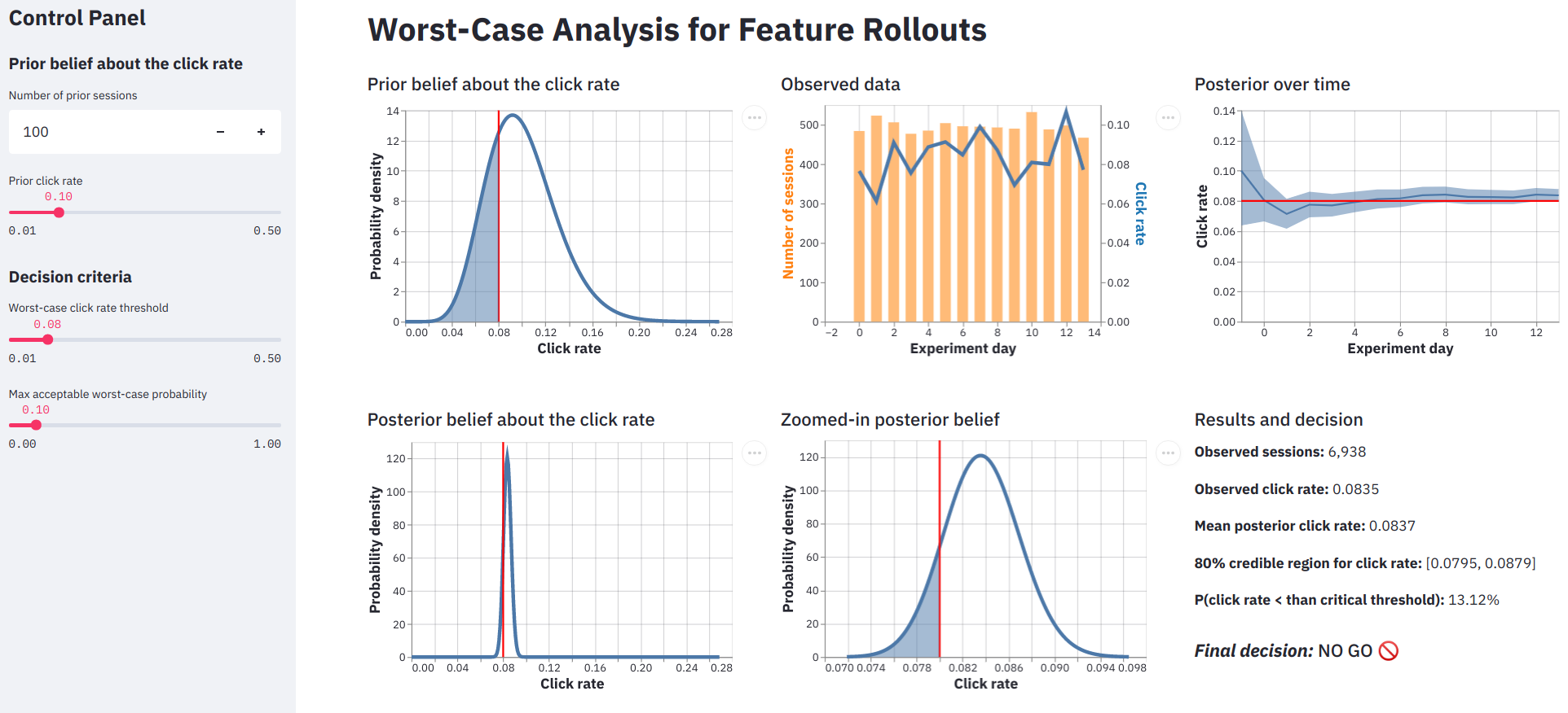
An interactive app for worst-case analysis of staged roll-out experiments. Please visit the live version to see the app in action.
The scenario
Continuing from our previous article, here’s the scene: a staged rollout of a new website feature, with session click rate as our primary metric. What decision-makers often want to know in this scenario is that the new site is no worse than the existing site. We formalize this by asking what’s the probability that the true click rate is less than some business-critical threshold? If we use \(\theta\) to represent the true click rate, \(\kappa\) for the business-critical threshold that defines the “worst-case” outcome, and \(\alpha\) be the maximum worst-case probability we can tolerate, then our decision rule is
\[
\mathbb{P}(\theta \leq \kappa) < \alpha
\]
If this statement is true, then we’re GO for the next phase of the rollout. Otherwise, it’s NO GO; we roll the new feature back try something else. For example, our company execs might say that as long as the click rate on our site doesn’t fall below 0.08, we’re good to keep going with the rollout. Specifically, as long as the probability of that low click rate is less than 10%, we’ll go forward.
Confidence intervals don’t cut it
Data scientists sometimes resort to confidence intervals in this situation. It’s an attractive option, at first blush. For starters, anybody who’s taken an intro stats class knows how to do it. More importantly, a confidence interval gives us both the worst-case threshold \(\kappa\)—the lower bound of the interval—and a probability \(\alpha\)—the significance level. A naïve data scientist might find, for example, an 80% confidence interval of \([0.079, 0.088]\) and conclude there’s only a 10% chance the true click rate is less than the lower bound of 0.079.
As we showed previously, this is an incorrect interpretation of the confidence interval; the logic for constructing the interval assumes the true click rate is fixed at some unknown value, so it’s not possible to then make probabilistic statements about the distribution of that same value. The closest we can get to a worst-case analysis with the confidence interval is to assume we didn’t draw an unusually weird sample (a correct assumption 80% of the time), assume the true click rate is within our interval, and conclude that a click rate of 0.079 is the smallest value that’s compatible with our data. Because this is smaller than 0.08, we should make a NO GO decision.
No matter how hard we try, we can’t transmogrify this result into the form we set out above as our decision criteria. What’s more, the confidence interval approach doesn’t give our decision-makers the freedom to choose both the business threshold and the confidence level. In this example, we’re forced to use the lower bound of the interval at 0.078 as our threshold, even though we know the more meaningful threshold would be 0.08.
Bayesian data analysis to the rescue!
So how can we answer our decision-makers’ question? With a Bayesian analysis. This method has several key advantages over the confidence interval approach:
It lets us directly estimate the quantity that decision-makers intuitively want
Our stakeholders can set both the business-critical threshold that defines the worst-case scenario and the maximum allowable chance of that scenario happening
We can incorporate prior information, which is especially handy for staged rollouts, where we don’t want to ignore the results from previous phases of the experiment.
It allows us to check how robust the results are to our prior beliefs about the click rate and to the decision-making criteria. This is super important when different stakeholders have different priors and decision criteria because it identifies those differences as the crux of the debate, rather than the red herring of statistical significance.
It provides a complete picture of our updated posterior belief about the click rate that we can use to compute all sorts of interesting things. In addition to our GO/NO GO decision criteria, we might also be interested in the expected value of the click rate if the worst-case situation does happen, for example.
This article is not a general introduction to Bayesian analysis; there are better resources for that. A few we recommend in particular:
We encourage you to check these references out but we hope you can use this article and our interactive app without any further background.
The data
Simulating data
As with any statistical analysis, we start with the data. For this article and our demo app, we simulate data for a hypothetical staged rollout. We imagine 500 web sessions per day on average with daily variation according to a Poisson distribution.1 Each day’s sessions yield some number of clicks, according to a binomial distribution. The true click rate is the parameter of that binomial; we set it at 0.085. The Python 3.9 code for this and the first three days of data:
In the app, the data is represented in the top middle plot. The number of daily sessions is shown in orange and the click rates in blue. In the following cell we show the plot code, but for the rest of the plots the code is folded by default.
Simulated data for an imaginary staged rollout. Daily session counts are in orange, corresponding click rates are in blue.
Modeling the data
Now we force ourselves to forget that we simulated the data…
Each day we observe \(n\) sessions, and we model the number of clicks \(y\) as a binomial random variable.
\[
y \sim \mathrm{Binomial}(n, \theta)
\]
We don’t choose the binomial distribution because we know it’s the true generating distribution; it’s an eminently reasonable likelihood function for most binary outcome data, even when we don’t know the underlying generating process. This distribution’s only parameter is the true click rate \(\theta\), which would be unknown and unknowable in a real problem. That is the thing we need to learn about from the data.
What do we already know about the click rate?
In most experiments we don’t start with a blank slate; data scientists and business units both have intuition about how well new features and products are likely to work. This is especially true for the later phases of a staged roll-out, where we have data from the previous phases.
We’re going to describe these prior beliefs about the click rate with a beta distribution. There are two reasons for this. First, its two parameters \(a\) and \(b\) are highly interpretable. Think of \(a\) as the number of clicks we’ve already seen and \(b\) as the prior number of sessions without a click (let’s call them misses). For a staged rollout, these could be real data from previous phases, but they could also be hypothetical. The stronger your stakeholder’s belief, the larger the prior number of sessions should be, and the higher they think the click rate is, the larger the number of clicks should be.
Probability distribution representing our belief about the click rate before running the experiment. The red line is the threshold for click rate that defines the “worst-case” scenario; it is set interactively in the app. The shaded blue region is the total probability of the worst-case outcome, according to our prior belief. With the default settings of the app, the worst-case outcome is about 27% likely.
The second reason why we use the beta distribution is that it hugely simplifies how we derive our updated posterior belief about the click rate.
Putting it together - the posterior
The fundamental goal of our analysis is to describe our belief about the parameter given both our prior assumptions and the data we’ve observed. This quantity is the posterior distribution; in math notation, it’s
\[
\mathbb{P}( \theta | \mathcal{D} )
\]
where $ $ represents the data. We obtain this by multiplying the prior distribution and the likelihood of the data given a parameter value. The posterior is proportional to this result, and that’s good enough because we know it’s a probability distribution and must sum or integrate to 1.
We’ve chosen a beta distribution as our prior with \(a\) clicks and \(b\) misses. The data likelihood is a binomial distribution with \(y\) clicks and \(n - y\) misses. Here’s where the second big advantage of the beta prior comes in; the result of multiplying the beta prior and the binomial likelihood is another beta distribution! The posterior beta distribution has hyperparameters that can be interpreted as \(a + y\) clicks and \(b + (n -y)\) misses.
This property is called conjugacy. A good source for the mathematical details is section 2.4 of Gelman et al.’s Bayesian Data Analysis, on Informative prior distributions. Crucially, using conjugate prior means we don’t have to do complicated math or sampling to derive our posterior.
Another cool thing about Bayesian updating is that we can update our posterior after observing each day’s data and the result is the same as if we had updated with all observed data at once. In our analysis and app, we do daily updates to see how the posterior evolves over time, and because this is a more realistic way to process the data.
Code
import copyresults = pd.DataFrame( {"mean": [prior.mean()],"p10": [prior.ppf(0.05)],"p90": [prior.ppf(0.95)], }, index=[-1],)posterior = copy.copy(prior)assert(id(posterior) !=id(prior))for t inrange(num_days):# This is the key posterior update logic, from the beta-binomial conjugate family. posterior = stats.beta( posterior.args[0] + data.loc[t, "clicks"], posterior.args[1] + data.loc[t, "misses"] )# Distribution descriptors results.at[t] = {"mean": posterior.mean(),"p10": posterior.ppf(0.1),"p90": posterior.ppf(0.9), }results.reset_index(inplace=True)out = results.melt(id_vars=["index"])out.head()
The mean and 80% credible interval of the posterior distribution of click rate, over time. Because our default prior is relatively weak, the observed data quickly shift the posterior downward.
Each row of the results DataFrame represents a day’s update, with index -1 representing our prior. The posterior update step is lines 16-19. In lines 22-26 we compute functions of the distribution to describe its shape because we can’t easily plot the entire distribution over time. The mean is the expected value of the posterior, while p10 and p90 together form the 80% credible interval. There is nothing special about the credible interval; it is not equivalent to a confidence interval. It’s just a way of characterizing the shape of the posterior in a condensed way.
The posterior time series plot shows a few important things:
The credible interval shrinks as we get more data, i.e. our certainty about the true click rate increases.
Intervals are useful. Due to pure randomness, the posterior mean drops pretty far below the true click rate (even though our prior is higher than the true click rate). The wide credible interval shows how much uncertainty we still had at that point in the experiment.
By day 7 of the experiment (counting from 0 as good Pythonistas), the posterior distribution seems to have stabilized. If we use the app to imagine a stronger and higher prior—say 1,000 sessions with a click rate of 0.2—the posterior time series shows that 14 days of data isn’t enough for the posterior to stabilize, and we need to collect more data.
It’s hard to get a sense just from the posterior mean and credible interval how certain we are that the true click rate is above our worst-case threshold, which is why it’s important to look at the full posterior distribution in detail.
Our posterior belief about the click rate, after seeing the experimental data. As with the prior, the red line is the business-critical threshold and the shaded area represents the worst-case probability. With the default app settings, the worst-case probability is about 13%.
In the app, this is the bottom middle plot. The bottom left plot is also the posterior on the same scale as the prior, to show how the posterior distribution narrows as we observe data and become more certain about the result.
Making a decision
The posterior distribution for click rate is not by itself the final answer. We need to guide our stakeholders toward the best action, or at least the probable consequences of different actions.
In our hypothetical scenario, we said our decision-makers want to go forward with the new feature roll-out if there’s less than a 10% chance that the true click rate is less than 0.08, or \(\mathbb{P}(\theta \leq 0.08) < 0.1\). We use the cdf method of the posterior distribution (a scipy.stats continuous random variable object) to compute the total probability of the worst-case scenario, i.e. the scenario where the click rate is less than 0.08.
Code
worst_case_max_proba =0.1prior_mean_click_rate = prior.mean()prior_worst_case_proba = prior.cdf(worst_case_threshold)posterior_mean_click_rate = posterior.mean()posterior_worst_case_proba = posterior.cdf(worst_case_threshold) # this is the key lineif posterior_worst_case_proba < worst_case_max_proba: final_decision ="GO"else: final_decision ="NO GO"print("Final decision:", final_decision)
Final decision: NO GO
Result
Value
Prior mean click rate
0.1
Prior worst-case probability
26.8%
Posterior mean click rate
0.0837
Posterior worst-case probability
13.12%
FINAL DECISION
NO GO
In this example, there’s still a 13% chance that the click rate is less than 8%, given our prior assumptions and the observed data, so we recommend to our execs that the roll-out should stop. It’s interesting to see that the posterior mean of 0.0837 is pretty close to the true click rate of 0.085. The problem is that we haven’t observed enough data to be sure that it’s truly above 0.08.
Stress-testing and building intuition with the interactive app
The interactive aspect of our Streamlit app is not just for fun. It helps us—and our stakeholders—to gain intuition about the method and the results, and to check the robustness of the outcome.
The app user controls four knobs on the left pane. The top two specify our a priori belief about the click rate and the bottom two set the criteria for the final decision.
The first two widgets on the app control panel specify our prior belief about the click rate. The higher we think the click rate is beforehand, the higher our posterior belief will be too. If we came into our experiment thinking the click rate was 0.15 instead of 0.1, then the posterior probability of the worst-case scenario would fall to just 9% and our decision would switch from NO-GO to GO.
Similarly, the more prior sessions we have (real or imagined), the more the prior influences the result. If we had just 310 prior sessions at a click rate of 0.1 instead of 100, our decision would also flip from NO-GO to GO.
These are surprisingly small changes that cause the final decision to reverse completely. This lack of robustness shows that specifying the prior can be critical, particularly when multiple stakeholders are involved, each of whom has their own intuition and assumptions. While this may seem like a bug in the methodology, it is in fact a major feature. The ability to plug in the perspectives of different stakeholders sometimes reveals the crux of a decision-making debate.
The issue of different stakeholder assumptions is even more clear when it comes to the decision criteria, which are the bottom two widgets on the app control panel. The worst-case click rate threshold is \(\kappa\), and it appears as a red line on the plots. The max acceptable worst-case probability is \(\alpha\); it only affects the final decision of GO or NO GO.
Final thoughts
It’s understandable that data scientists would use confidence intervals for worst-case analyses. It’s a technique taught in every intro stats class, the procedure seems to provide all the information we need, and the result is often very similar to the credible interval from the Bayesian approach.
The Bayesian approach that we’ve shown here is much better, for many, many reasons. Not only does it give the interpretation that our stakeholders want, it allows them to define both the worst-case scenario and the maximum allowable chances of that scenario occurring. And while the confidence interval method may yield the right answer for the wrong reason, once we use an informative prior—a very natural thing to do in a staged rollout where we have data from past phases of the experiment—all bets are off. Why not do the right thing from the start?
Furthermore, the Bayesian method lets us compare different prior distributions, to check the robustness of the results or to reflect the different assumptions of different stakeholders. Lastly, this approach gives us a fuller picture of the result in the form of a posterior distribution. With the posterior, we can compute all sorts of useful things, like the expected revenue of the new feature given revenue-per-click data, or the expected value of the click rate if the worst-case scenario does come to pass.
One thing a Bayesian analysis does not do is eliminate the need for thoughtful data science and decision-making. Even in our relatively simple click rate example, there is plenty of room for argument. While the posterior distribution seems to have stabilized, our posterior results are quite different from what we expected a priori.
Maybe the final decision shouldn’t be a hard NO-GO; maybe it should be PAUSE, while we investigate what caused such a big surprise. Maybe it’s an engineering bug and we can resume the feature rollout after it’s resolved. In the end, critical thinking is, well, critical for every statistical method.
Footnotes
A more realistic simulation would probably include day-of-week effects too.↩︎
Source Code
---title: "How to analyze a staged rollout experiment"author: "Brian Kent"date: "2021-05-07"image: worst_case_data.pngcategories: [experimentation, Python, data apps]description: | Recently we argued that confidence intervals are a poor choice for analyzing staged rollout experiments. In this article, we show a better way: a Bayesian approach that gives decision-makers the answers they really need. Check out our interactive Streamlit app first, then the article for the details.format: html: include-in-header: text: <link rel="canonical" href="https://www.crosstab.io/articles/staged-rollout-analysis/">css: index.css---::: {.callout-tip}This article is the second part of a two-part series. The first part---why confidenceintervals are a bad idea for worst-case analysis---is [here][first-part]. The Streamlitapp that accompanies this article is also explained in the post [Streamlit review anddemo: best of the Python data app tools][app-article].:::We [recently argued][prev-article] that confidence intervals are a bad way to analyzestaged rollout experiments. In this article, we describe a better way. Better yet, we'vebuilt a [live, interactive Streamlit app][app] to *show* the better way. Check it out,then follow along as we talk through the methodology, the app, and the decision-makingprocess. to see the app in action.](worst_case_app.png)## The scenarioContinuing from our previous article, here's the scene: a staged rollout of a newwebsite feature, with session click rate as our primary metric. **What decision-makers often want to know in this scenario is that the new site is *no worse* than the existing site.** We formalize this by asking *what's the probability that the true click rate is less than some business-critical threshold?* If we use $\theta$ to represent the true click rate, $\kappa$ for the business-critical threshold thatdefines the “worst-case” outcome, and $\alpha$ be the maximum worst-caseprobability we can tolerate, then our decision rule is $$\mathbb{P}(\theta \leq \kappa) < \alpha$$**If this statement is true, then we're GO for the next phase of the rollout. Otherwise, it's NO GO; we roll the new feature back try something else.** For example, our company execs might say that as long as the click rate on our site doesn't fall below 0.08,we're good to keep going with the rollout. Specifically, as long as the probability ofthat low click rate is less than 10%, we'll go forward.## Confidence intervals don't cut itData scientists sometimes resort to confidence intervals in this situation. It's anattractive option, at first blush. For starters, anybody who's taken an intro statsclass knows how to do it. More importantly, a confidence interval gives us both theworst-case threshold $\kappa$—the lower bound of the interval—and aprobability $\alpha$—the significance level. A naïve data scientist mightfind, for example, an 80% confidence interval of $[0.079, 0.088]$ and concludethere's only a 10% chance the true click rate is less than the lower bound of 0.079.As we showed [previously][prev-article], this is an incorrect interpretation of theconfidence interval; the logic for constructing the interval assumes the true click rateis *fixed* at some unknown value, so it's not possible to then make probabilisticstatements about the distribution of that same value. The closest we can get to aworst-case analysis with the confidence interval is to *assume* we didn't draw anunusually weird sample (a correct assumption 80% of the time), *assume* the true clickrate is within our interval, and conclude that a click rate of 0.079 is the smallestvalue that's compatible with our data. Because this is smaller than 0.08, we should makea NO GO decision.**No matter how hard we try, we can't transmogrify this result into the form we set outabove as our decision criteria.** What's more, the confidence interval approach doesn'tgive our decision-makers the freedom to choose both the business threshold and theconfidence level. In this example, we're forced to use the lower bound of the intervalat 0.078 as our threshold, even though we know the more meaningful threshold would be0.08.## Bayesian data analysis to the rescue!So how *can* we answer our decision-makers' question? With a **Bayesian analysis**. Thismethod has several key advantages over the confidence interval approach:1. It lets us directly estimate the quantity that decision-makers intuitively want2. Our stakeholders can set *both* the business-critical threshold that defines the worst-case scenario and the maximum allowable chance of that scenario happening3. We can incorporate prior information, which is especially handy for staged rollouts, where we don't want to ignore the results from previous phases of the experiment.4. It allows us to check how robust the results are to our prior beliefs about the click rate and to the decision-making criteria. This is super important when different stakeholders have different priors and decision criteria because it identifies those differences as the crux of the debate, rather than the red herring of statistical significance.5. It provides a complete picture of our updated posterior belief about the click rate that we can use to compute all sorts of interesting things. In addition to our GO/NO GO decision criteria, we might also be interested in the expected value of the click rate if the worst-case situation *does* happen, for example.This article is not a general introduction to Bayesian analysis; there are betterresources for that. A few we recommend in particular:- McElreath, [Statistical Rethinking][stat-rethinking-book]- Gelman, et al., [Bayesian Data Analysis][bda-book].- Jake VanderPlas, [Frequentism and Bayesianism: A Python-driven Primer][jvdp-paper]We encourage you to check these references out but we hope you can use this article andour interactive app without any further background.## The data### Simulating dataAs with any statistical analysis, we start with the data. **For this article and ourdemo app, we simulate data for a hypothetical staged rollout.** We imagine 500 websessions per day on average with daily variation according to a Poissondistribution.^[A more realistic simulation would probably include day-of-week effects too.] Each day's sessions yieldsome number of clicks, according to a binomial distribution. The true click rate is theparameter of that binomial; we set it at 0.085. The Python 3.9 code for this and thefirst three days of data:```{python}import numpy as npimport pandas as pdimport scipy.stats as statsrng = np.random.default_rng(2)num_days =14avg_daily_sessions =500click_rate =0.085sessions = stats.poisson.rvs(mu=avg_daily_sessions, size=num_days, random_state=rng)clicks = stats.binom.rvs(n=sessions, p=click_rate, size=num_days, random_state=rng)data = pd.DataFrame({"day": range(num_days),"sessions": sessions,"clicks": clicks,"misses": sessions - clicks,"click_rate": clicks / sessions,})data.head(3)```In the app, the data is represented in the top middle plot. The number of daily sessionsis shown in orange and the click rates in blue. In the following cell we show the plot code, but for the rest of the plots the code is folded by default.```{python}#| fig-cap: Simulated data for an imaginary staged rollout. Daily session counts are in orange, corresponding click rates are in blue.import altair as altbase = alt.Chart(data).encode(alt.X("day", title="Experiment day"))volume_fig = base.mark_bar(color="#ffbb78", size=12).encode( y=alt.Y("sessions", axis=alt.Axis(title="Number of sessions", titleColor="#ff7f0e") ), tooltip=[alt.Tooltip("sessions", title="Num sessions")],)rate_fig = base.mark_line(size=4).encode( y=alt.Y("click_rate", axis=alt.Axis(title="Click rate", titleColor="#1f77b4")), tooltip=[alt.Tooltip("click_rate", title="Click rate", format=".3f")],)fig = ( alt.layer(volume_fig, rate_fig) .resolve_scale(y="independent") .configure_axis(labelFontSize=12, titleFontSize=16))fig```### Modeling the dataNow we force ourselves to forget that we simulated the data...Each day we observe $n$ sessions, and we model the number of clicks $y$ as a binomial random variable.$$y \sim \mathrm{Binomial}(n, \theta)$$We don't choose the binomial distribution because we know it's the true generatingdistribution; it's an eminently reasonable likelihood function for most binary outcomedata, even when we don't know the underlying generating process. This distribution'sonly parameter is the true click rate $\theta$, which would be unknown andunknowable in a real problem. That is the thing we need to learn about from the data.## What do we already know about the click rate?**In most experiments we don't start with a blank slate; data scientists and businessunits both have intuition about how well new features and products are likely to work.**This is especially true for the later phases of a staged roll-out, where we have datafrom the previous phases.We're going to describe these prior beliefs about the click rate with a [beta distribution](https://en.wikipedia.org/wiki/Beta_distribution). There aretwo reasons for this. First, its two parameters $a$ and $b$ are highlyinterpretable. Think of $a$ as the number of clicks we've already seen and $b$as the prior number of sessions without a click (let's call them *misses*). For astaged rollout, these could be real data from previous phases, but they could also behypothetical. The stronger your stakeholder's belief, the larger the prior number ofsessions should be, and the higher they think the click rate is, the larger the numberof clicks should be.](PDF_of_the_Beta_distribution.gif)The initial setting in our interactive app, for example, is 100 prior sessions, 10 ofwhich resulted in clicks. ```{python}prior_sessions =100# Adjust these hyperparameters interactively in the appprior_click_rate =0.1worst_case_threshold =0.08prior_clicks =int(prior_sessions * prior_click_rate)prior_misses = prior_sessions - prior_clicksprior = stats.beta(prior_clicks, prior_misses)``````{python}#| fig-cap: Probability distribution representing our belief about the click rate before running the experiment. The red line is the threshold for click rate that defines the “worst-case” scenario; it is set interactively in the app. The shaded blue region is the total probability of the worst-case outcome, according to our prior belief. With the default settings of the app, the worst-case outcome is about 27% likely.#| code-fold: truedistro_grid = np.linspace(0, 0.3, 100)prior_pdf = pd.DataFrame( {"click_rate": distro_grid, "prior_pdf": [prior.pdf(x) for x in distro_grid]})fig = ( alt.Chart(prior_pdf) .mark_line(size=4) .encode( x=alt.X("click_rate", title="Click rate"), y=alt.Y("prior_pdf", title="Probability density"), tooltip=[ alt.Tooltip("click_rate", title="Click rate", format=".3f"), alt.Tooltip("prior_pdf", title="Probability density", format=".3f"), ], ))threshold_rule = ( alt.Chart(pd.DataFrame({"x": [worst_case_threshold]})) .mark_rule(size=2, color="red") .encode(x="x", tooltip=[alt.Tooltip("x", title="Worst-case threshold")]))worst_case_prior_pdf = prior_pdf[prior_pdf["click_rate"] < worst_case_threshold]worst_case_area = ( alt.Chart(worst_case_prior_pdf) .mark_area(opacity=0.5) .encode(x="click_rate", y="prior_pdf"))fig = alt.layer(fig, threshold_rule, worst_case_area).configure_axis( labelFontSize=12, titleFontSize=16)fig```**The second reason why we use the beta distribution is that it hugely simplifies how we derive our updated posterior belief about the click rate.**## Putting it together - the posteriorThe fundamental goal of our analysis is to describe our belief about the parameter givenboth our prior assumptions and the data we've observed. This quantity is the **posteriordistribution**; in math notation, it's$$\mathbb{P}( \theta | \mathcal{D} )$$where $ \mathcal{D}$ represents the data. We obtain this by multiplying the priordistribution and the likelihood of the data given a parameter value. The posterior isproportional to this result, and that's good enough because we know it's a probabilitydistribution and must sum or integrate to 1.$$\mathbb{P}( \theta | \mathcal{D} ) \propto \mathbb{P}(\theta) \cdot \mathcal{L}(\mathcal{D} | \theta)$$We've chosen a beta distribution as our prior with $a$ clicks and $b$ misses.The data likelihood is a binomial distribution with $y$ clicks and $n - y$misses. Here's where the second big advantage of the beta prior comes in; <b>the resultof multiplying the beta prior and the binomial likelihood is another betadistribution!</b> The posterior beta distribution has hyperparameters that can beinterpreted as $a + y$ clicks and $b + (n -y)$ misses.This property is called **conjugacy**. A good source for the mathematical details issection 2.4 of Gelman et al.'s [Bayesian Data Analysis][bda-book], on *Informative priordistributions*. Crucially, using conjugate prior means we don't have to do complicatedmath or sampling to derive our posterior.**Another cool thing about Bayesian updating is that we can update our posterior afterobserving each day's data and the result is the same as if we had updated with allobserved data at once.** In our analysis and app, we do daily updates to see how theposterior evolves over time, and because this is a more realistic way to process thedata.```{python}import copyresults = pd.DataFrame( {"mean": [prior.mean()],"p10": [prior.ppf(0.05)],"p90": [prior.ppf(0.95)], }, index=[-1],)posterior = copy.copy(prior)assert(id(posterior) !=id(prior))for t inrange(num_days):# This is the key posterior update logic, from the beta-binomial conjugate family. posterior = stats.beta( posterior.args[0] + data.loc[t, "clicks"], posterior.args[1] + data.loc[t, "misses"] )# Distribution descriptors results.at[t] = {"mean": posterior.mean(),"p10": posterior.ppf(0.1),"p90": posterior.ppf(0.9), }results.reset_index(inplace=True)out = results.melt(id_vars=["index"])out.head()``````{python}#| fig-cap: The mean and 80% credible interval of the posterior distribution of click rate, over time. Because our default prior is relatively weak, the observed data quickly shift the posterior downward.#| code-fold: truets_mean = ( alt.Chart(results) .mark_line() .encode( x="index", y="mean", ))band = ( alt.Chart(results) .mark_area(opacity=0.5) .encode( x=alt.X("index", title="Experiment day"), y=alt.Y("p10", title="Click rate"), y2="p90", tooltip=[ alt.Tooltip("index", title="Experiment day"), alt.Tooltip("p10", title="80% credible interval lower", format=".3f"), alt.Tooltip("p90", title="80% credible interval upper", format=".3f"), ], ))threshold_rule = ( alt.Chart(pd.DataFrame({"y": [worst_case_threshold]})) .mark_rule(size=2, color="red") .encode(y="y"))fig = alt.layer(ts_mean, band, threshold_rule).configure_axis( labelFontSize=12, titleFontSize=16)fig```Each row of the `results` DataFrame represents a day's update, with index -1 representing our prior. The posterior update step is lines 16-19. In lines 22-26 we compute functions of the distribution to describe its shape because we can't easily plot the entire distribution over time. The `mean` isthe expected value of the posterior, while `p10` and `p90` together form the 80% **credible interval**. **There is nothing special about the credible interval; it is *not* equivalent to a confidence interval. It's just a way of characterizing the shape of the posterior in a condensedway.**The posterior time series plot shows a few important things:1. **The credible interval shrinks as we get more data**, i.e. our certainty about the true click rate increases.2. Intervals are useful. Due to pure randomness, the posterior mean drops pretty far below the true click rate (even though our prior is *higher* than the true click rate). **The wide credible interval shows how much uncertainty we still had at that point in the experiment.**3. By day 7 of the experiment (counting from 0 as good Pythonistas), the posterior distribution seems to have stabilized. If we use the app to imagine a stronger and higher prior---say 1,000 sessions with a click rate of 0.2---the posterior time series shows that 14 days of data *isn't* enough for the posterior to stabilize, and we need to collect more data.4. It's hard to get a sense just from the posterior mean and credible interval how certain we are that the true click rate is above our worst-case threshold, which is why **it's important to look at the full posterior distribution in detail.**The full posterior looks like this:```{python}#| fig-cap: Our posterior belief about the click rate, after seeing the experimental data. As with the prior, the red line is the business-critical threshold and the shaded area represents the worst-case probability. With the default app settings, the worst-case probability is about 13%.#| code-fold: truexmin =0.05xmax =0.15distro_grid = np.linspace(xmin, xmax, 100)posterior_pdf = pd.DataFrame( {"click_rate": distro_grid,"posterior_pdf": [posterior.pdf(x) for x in distro_grid], })fig = ( alt.Chart(posterior_pdf) .mark_line(size=4) .encode( x=alt.X("click_rate", title="Click rate", scale=alt.Scale(domain=[xmin, xmax])), y=alt.Y("posterior_pdf", title="Probability density"), tooltip=[ alt.Tooltip("click_rate", title="Click rate", format=".3f"), alt.Tooltip("posterior_pdf", title="Probability density", format=".3f"), ], ))threshold_rule = ( alt.Chart(pd.DataFrame({"x": [worst_case_threshold]})) .mark_rule(size=2, color="red") .encode(x="x", tooltip=[alt.Tooltip("x", title="Worst-case threshold")]))worst_case_post_pdf = posterior_pdf[posterior_pdf["click_rate"] < worst_case_threshold]worst_case_area = ( alt.Chart(worst_case_post_pdf) .mark_area(opacity=0.5) .encode(x="click_rate", y="posterior_pdf"))fig = alt.layer(fig, worst_case_area, threshold_rule).configure_axis( labelFontSize=12, titleFontSize=16)fig```In the app, this is the bottom middle plot. The bottom left plot is also the posterioron the same scale as the prior, to show how the posterior distribution narrows as weobserve data and become more certain about the result.## Making a decisionThe posterior distribution for click rate is not by itself the final answer. **We needto guide our stakeholders toward the best *action*, or at least the probableconsequences of different actions.**In our hypothetical scenario, we said our decision-makers want to go forward with thenew feature roll-out if there's less than a 10% chance that the true click rate is lessthan 0.08, or $\mathbb{P}(\theta \leq 0.08) < 0.1$. We use the `cdf` method of the posterior distribution (a `scipy.stats` continuous random variable object) to compute thetotal probability of the worst-case scenario, i.e. the scenario where the click rate isless than 0.08.```{python}worst_case_max_proba =0.1prior_mean_click_rate = prior.mean()prior_worst_case_proba = prior.cdf(worst_case_threshold)posterior_mean_click_rate = posterior.mean()posterior_worst_case_proba = posterior.cdf(worst_case_threshold) # this is the key lineif posterior_worst_case_proba < worst_case_max_proba: final_decision ="GO"else: final_decision ="NO GO"print("Final decision:", final_decision)```| Result | Value || --- | --- || Prior mean click rate | 0.1 || Prior worst-case probability | 26.8% || Posterior mean click rate | 0.0837 || Posterior worst-case probability | 13.12% || FINAL DECISION | NO GO |In this example, **there's still a 13% chance that the click rate is less than 8%, givenour prior assumptions and the observed data, so we recommend to our execs that theroll-out should stop.** It's interesting to see that the posterior mean of 0.0837 ispretty close to the true click rate of 0.085. The problem is that we haven't observedenough data to be sure that it's truly above 0.08.## Stress-testing and building intuition with the interactive appThe interactive aspect of our Streamlit app is not just for fun. It helps us---and ourstakeholders---to gain intuition about the method and the results, and to check therobustness of the outcome.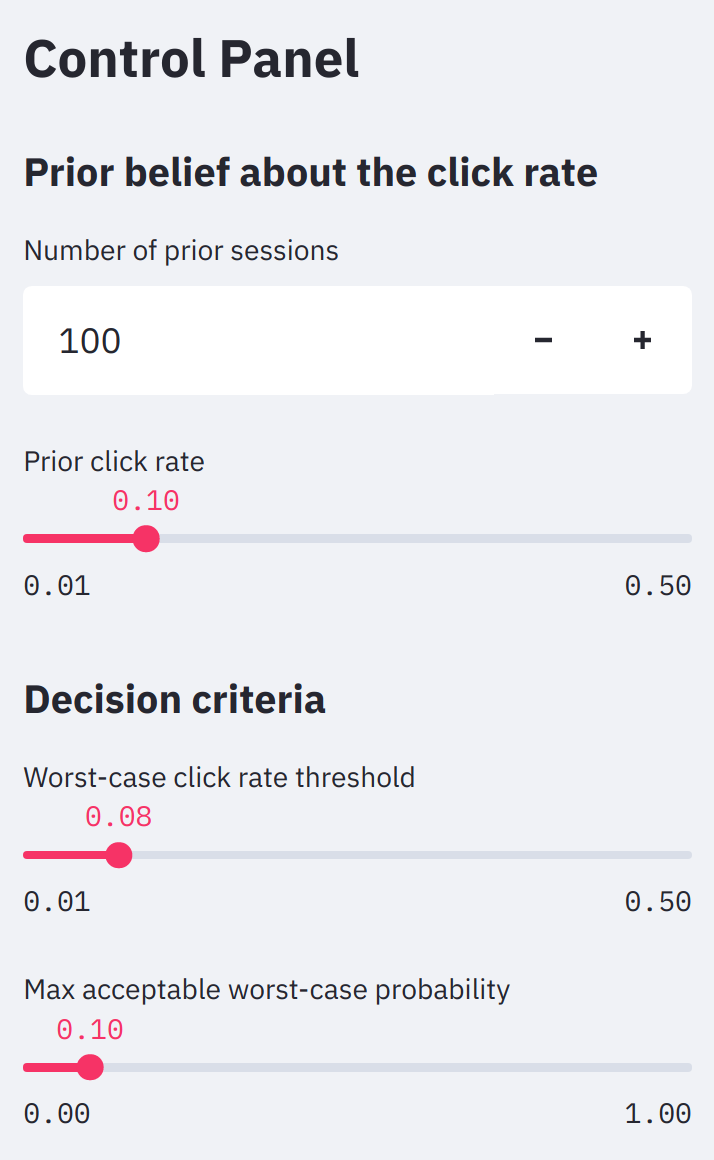{.w-md-50}The first two widgets on the app control panel specify our prior belief about the clickrate. **The higher we think the click rate is beforehand, the higher our posteriorbelief will be too.** If we came into our experiment thinking the click rate was 0.15instead of 0.1, then the posterior probability of the worst-case scenario would fall tojust 9% and our decision would switch from NO-GO to GO.Similarly, **the more prior sessions we have (real or imagined), the more the priorinfluences the result.** If we had just 310 prior sessions at a click rate of 0.1instead of 100, our decision would also flip from NO-GO to GO.These are surprisingly small changes that cause the final decision to reversecompletely. **This lack of robustness shows that specifying the prior can be critical,particularly when multiple stakeholders are involved, each of whom has their ownintuition and assumptions.** While this may seem like a bug in the methodology, it is infact a major feature. The ability to plug in the perspectives of different stakeholderssometimes reveals the crux of a decision-making debate.The issue of different stakeholder assumptions is even more clear when it comes to thedecision criteria, which are the bottom two widgets on the app control panel. The*worst-case click rate threshold* is $\kappa$, and it appears as a red lineon the plots. The *max acceptable worst-case probability* is $\alpha$; it only affects the final decision of GO or NO GO.## Final thoughtsIt's understandable that data scientists would use confidence intervals for worst-caseanalyses. It's a technique taught in every intro stats class, the procedure *seems* toprovide all the information we need, and the result is often very similar to thecredible interval from the Bayesian approach.**The Bayesian approach that we've shown here is much better, for many, many reasons.**Not only does it give the interpretation that our stakeholders want, it allows them todefine *both* the worst-case scenario and the maximum allowable chances of that scenariooccurring. And while the confidence interval method may yield the right answer for thewrong reason, once we use an informative prior---a very natural thing to do in a stagedrollout where we have data from past phases of the experiment---all bets are off. Whynot do the right thing from the start?Furthermore, the Bayesian method lets us compare different prior distributions, to checkthe robustness of the results or to reflect the different assumptions of differentstakeholders. Lastly, this approach gives us a fuller picture of the result in the formof a posterior distribution. With the posterior, we can compute all sorts of usefulthings, like the expected revenue of the new feature given revenue-per-click data, orthe expected value of the click rate if the worst-case scenario *does* come to pass.**One thing a Bayesian analysis does *not* do is eliminate the need for thoughtful datascience and decision-making.** Even in our relatively simple click rate example, thereis plenty of room for argument. While the posterior distribution seems to havestabilized, our posterior results are quite different from what we expected *a priori*. Maybe the final decision shouldn't be a hard NO-GO; maybe it should be PAUSE, while weinvestigate what caused such a big surprise. Maybe it's an engineering bug and we canresume the feature rollout after it's resolved. In the end, critical thinking is, well,critical for every statistical method.[prev-article]: https://www.crosstab.io/articles/confidence-interval-interpretation[app]: https://share.streamlit.io/crosstabkite/worst-case-analysis/app.py[app-repo]: https://github.com/CrosstabKite/worst-case-analysis[stat-rethinking-book]: https://xcelab.net/rm/statistical-rethinking/[bda-book]: http://www.stat.columbia.edu/~gelman/book/[jvdp-paper]: https://arxiv.org/pdf/1411.5018.pdf[wiki-beta-distro]: https://en.wikipedia.org/wiki/Beta_distribution[first-part]: ../confidence-interval-interpretation[app-article]: ../streamlit-review
